KAWALANG
Third year group project
Kawalang
Digital Design
Branding Design
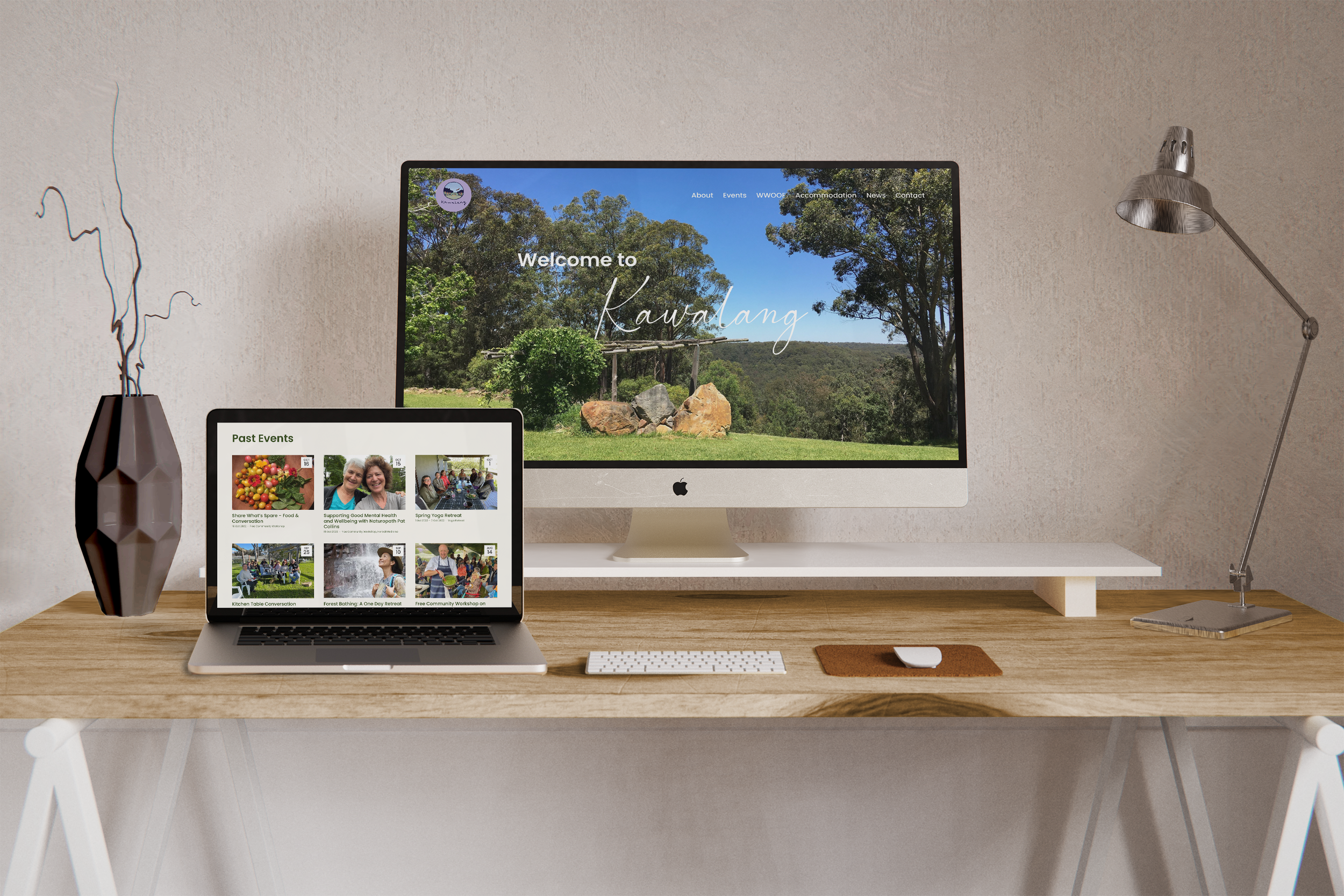
This was a group project with four peers for our live client Kawalang. The brief was to redesign Kawalang’s website, promotional print materials and develop a social media presence for them.
Explore the website
The Key Objectives
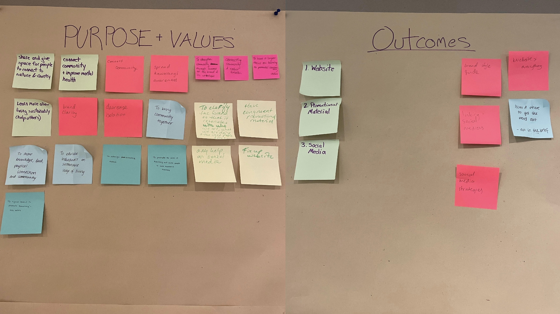
1. To increase awareness about and participation in Kawalang’s programs and events
2. To strengthen community networks, resilience and sustainability
3. To clarify the brand to be consistent, so it resonates with who Kawalang is and ensures what they do is speaking to the right people
The Concept
Reconnect frames Kawalang as a meeting place where personal and collective journeys happen, and countless opportunities for learning and engaging with living sustainably are available.
The Outcome
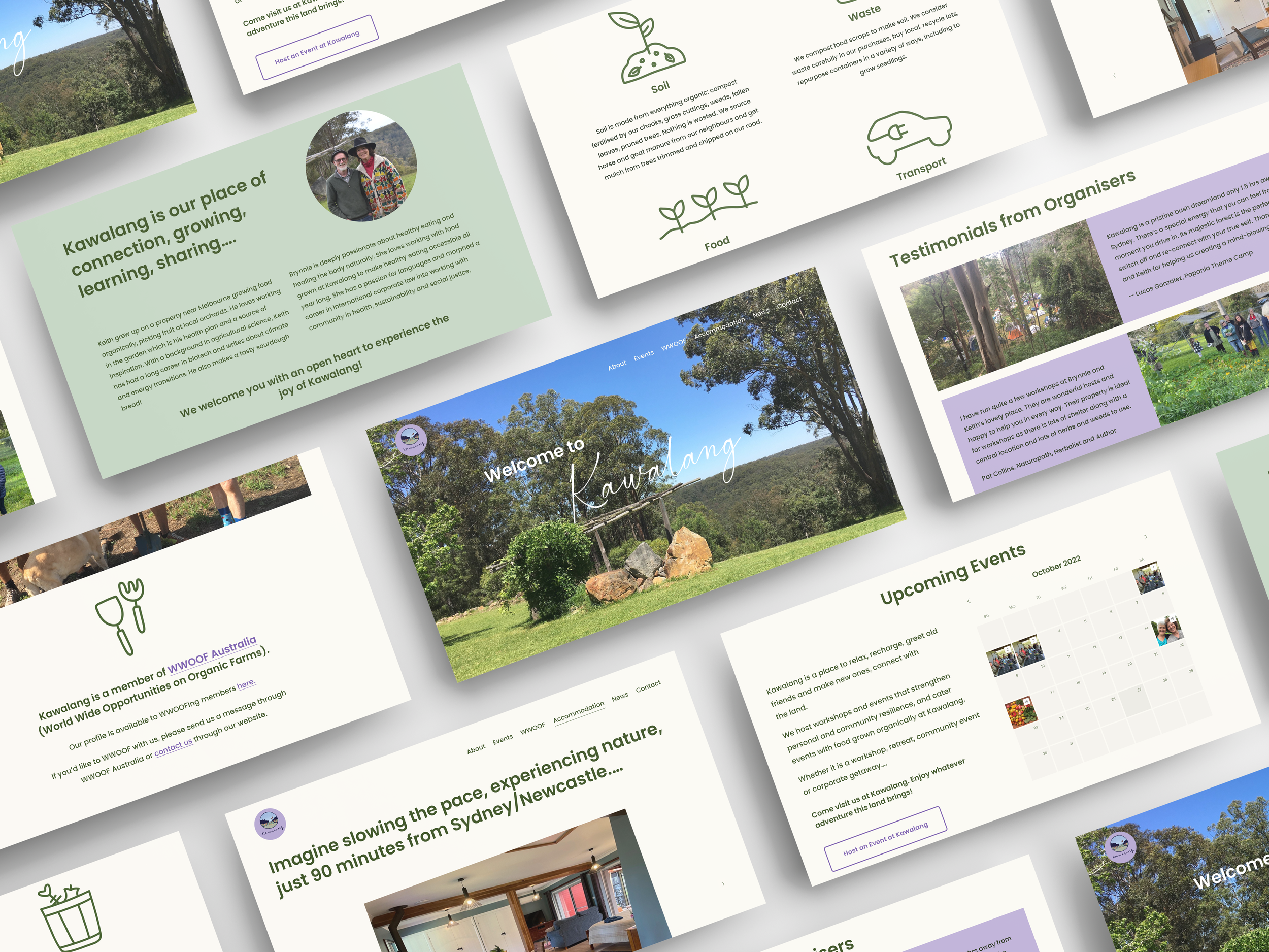
The client was delighted with the website built on Squarespace, flyers, and social media materials. The refreshed colour palette and typography are designed to grow with Kawalang’s evolving brand.
My Contribution
I completed the UI/UX analysis of the existing website, facilitated the workshop with the client, and completed two customer interviews. Everyone contributed to the research phase. I developed the ‘Home’, ‘Attend an Event’, ‘ Host an Event’ and ‘Accommodation’ pages of the website, built them in Squarespace and reviewed all the pages to ensure consistency.
The Visual Design Development
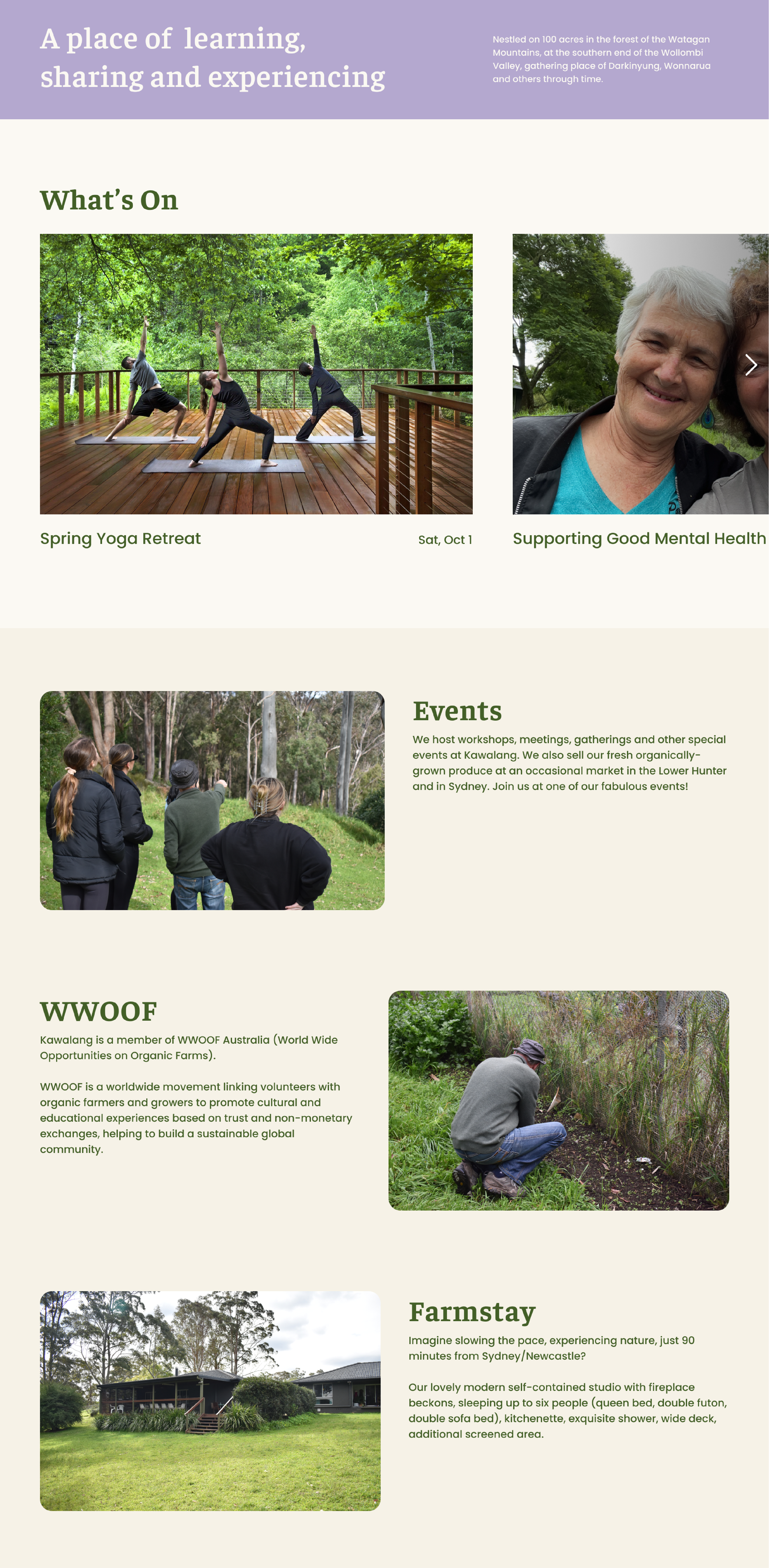
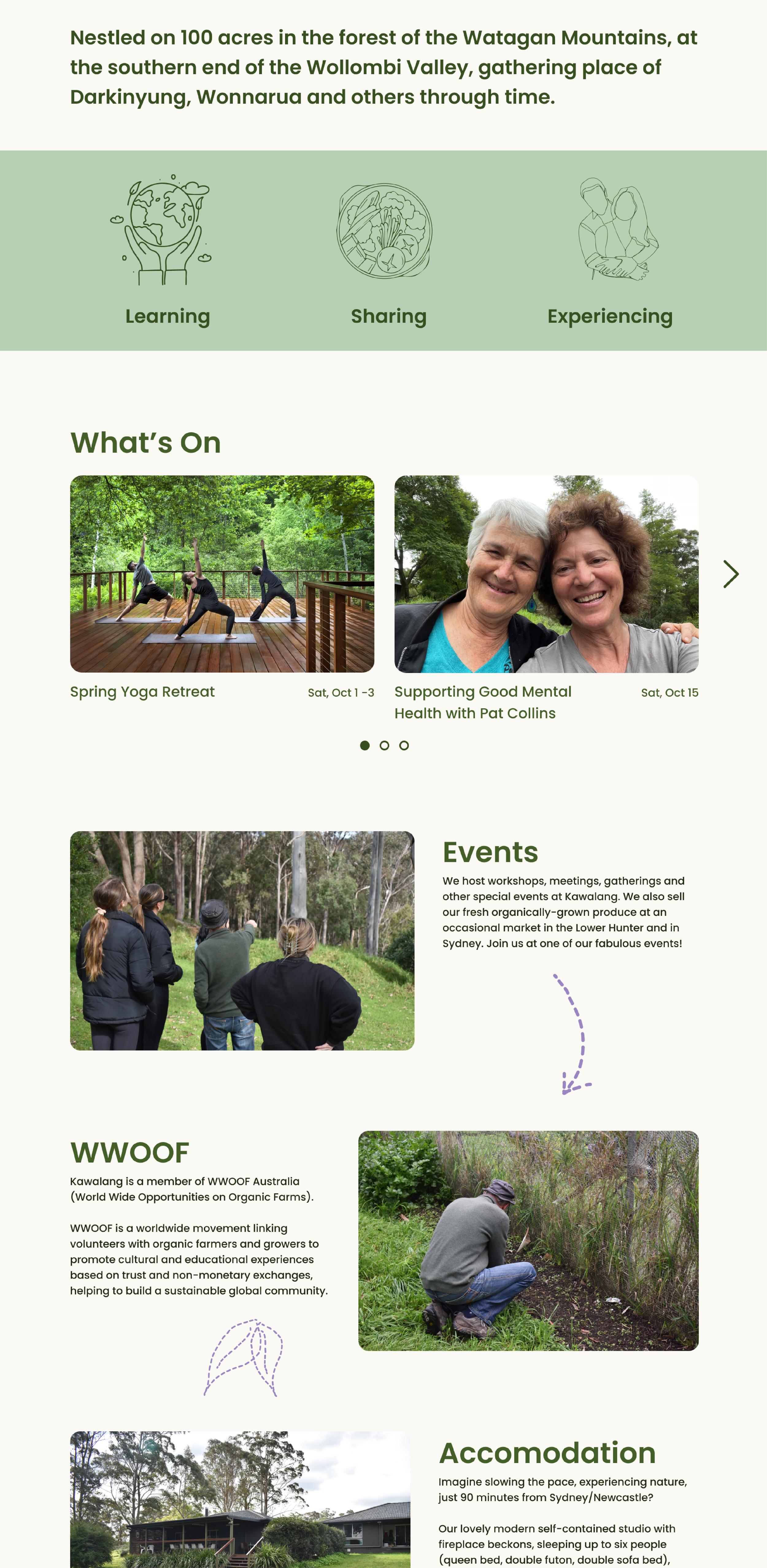
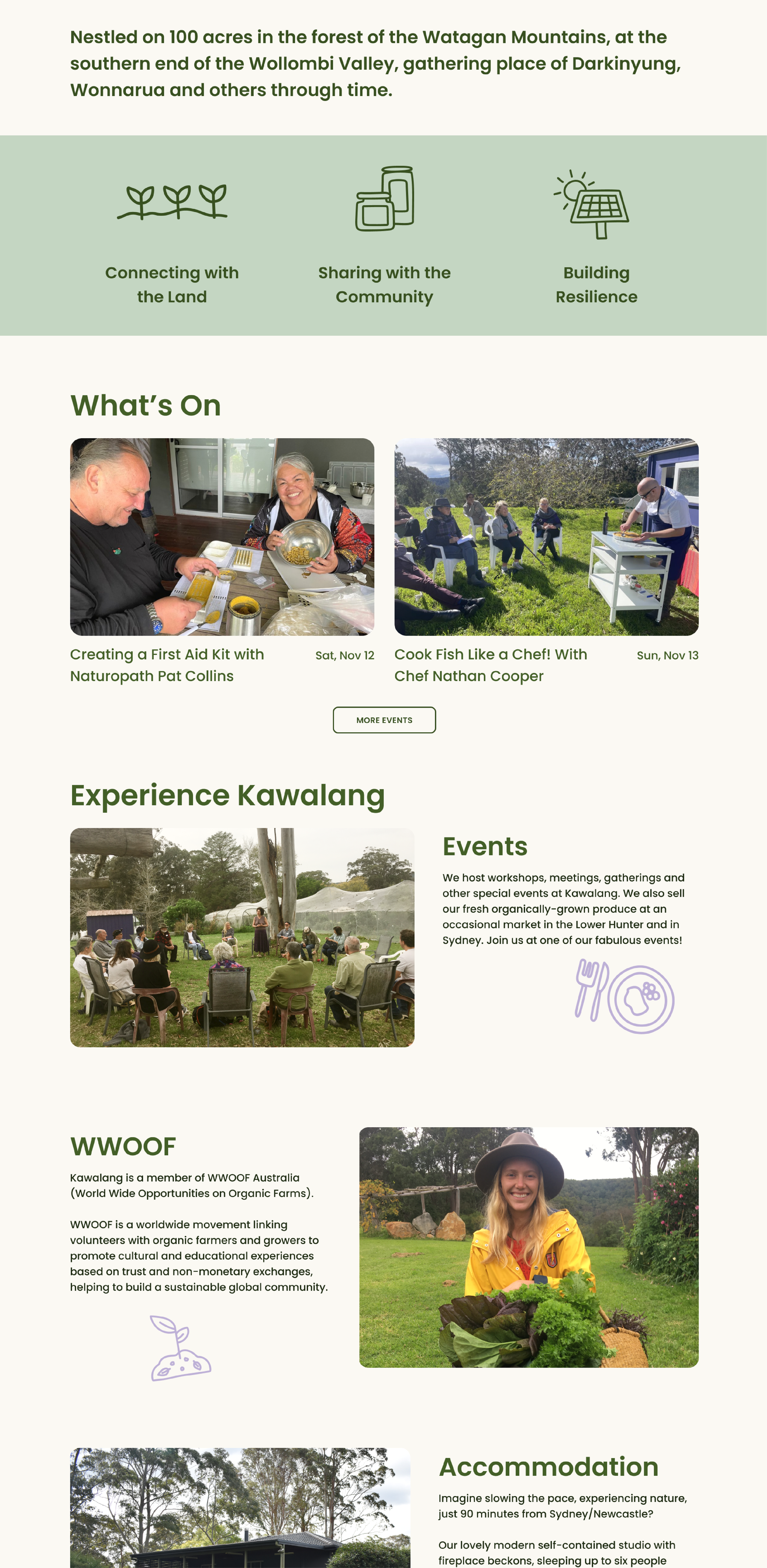
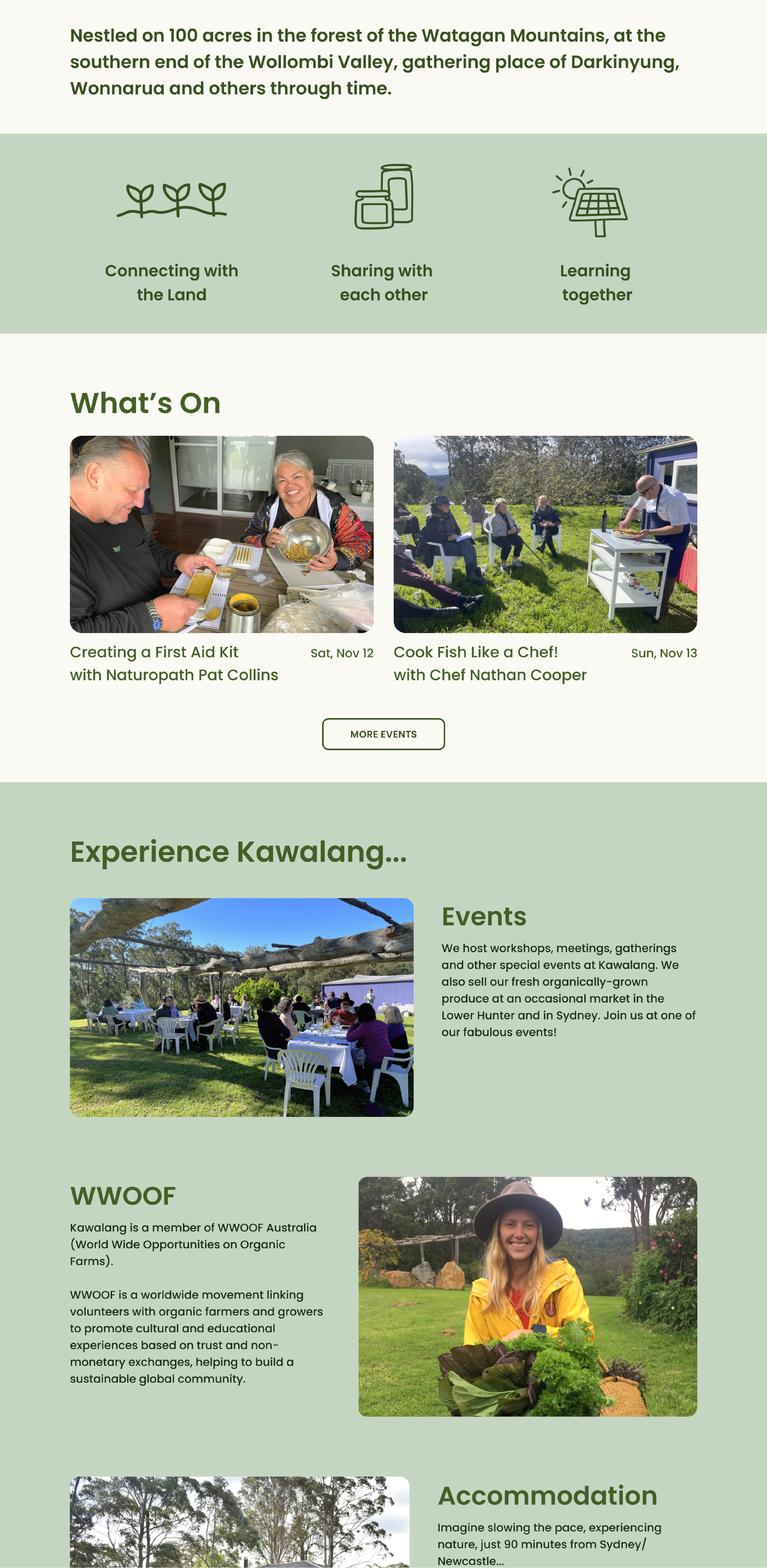
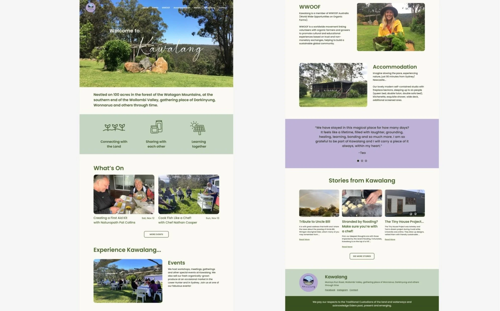
These four images show some of the progression of the home page design in Figma. There were a variety of considerations I had in mind throughout this development. First was the typography. Initially, I used a serif font for the titles to provide a sense of trustworthiness and warmth. The client wanted something more friendly and less formal, so I switched to Poppins, a sans-serif font. This soft, welcoming feeling was built upon by rounding the corners of the images, using a generally warm colour palette, and icons with a thicker line weight that feels more friendly. Coloured blocking the different sections helps emphasise each one, with the green sections reflecting Kawalang’s strong connection to nature. Purple was used as an accent colour and was brought in more in the design we built in Squarespace. Hierarchy is created by using different sizes and weights of Poppins that emphasise the headings and make it easy to navigate the content on the page. Leaving white space in the composition creates breathing room and helps it be more balanced and relaxed. Finally, the scale of the text and sections was optimised for viewing on a computer and ensuring it was easy for older adults to read the text.
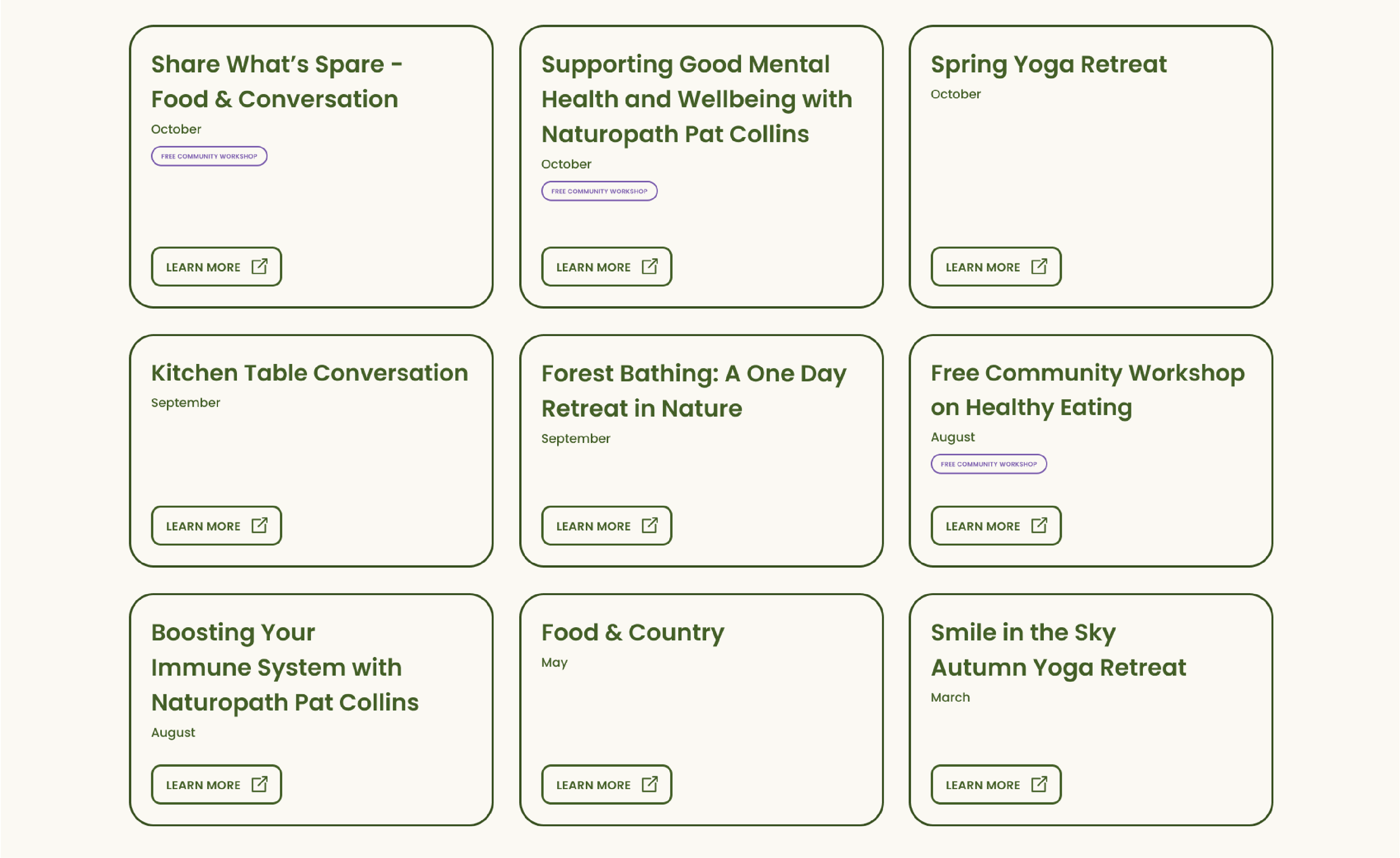
This Figma design wasn’t able to be replicated due to the constraints of Squarespace. However, it shows a strong grid and hierarchy. To ensure the rows were all the same height, more white space was needed in some of the boxes so it feels balanced. The rounded corners ensure the grid doesn’t have hard lines or sharp edges that clash with the flow and welcoming feel of the design. Purple is used to emphasise the events that are labelled as ‘Free community workshops’. The thickness of the lines was chosen so they still feel consistent and balanced within the overall design, without being overbearing or too delicate.
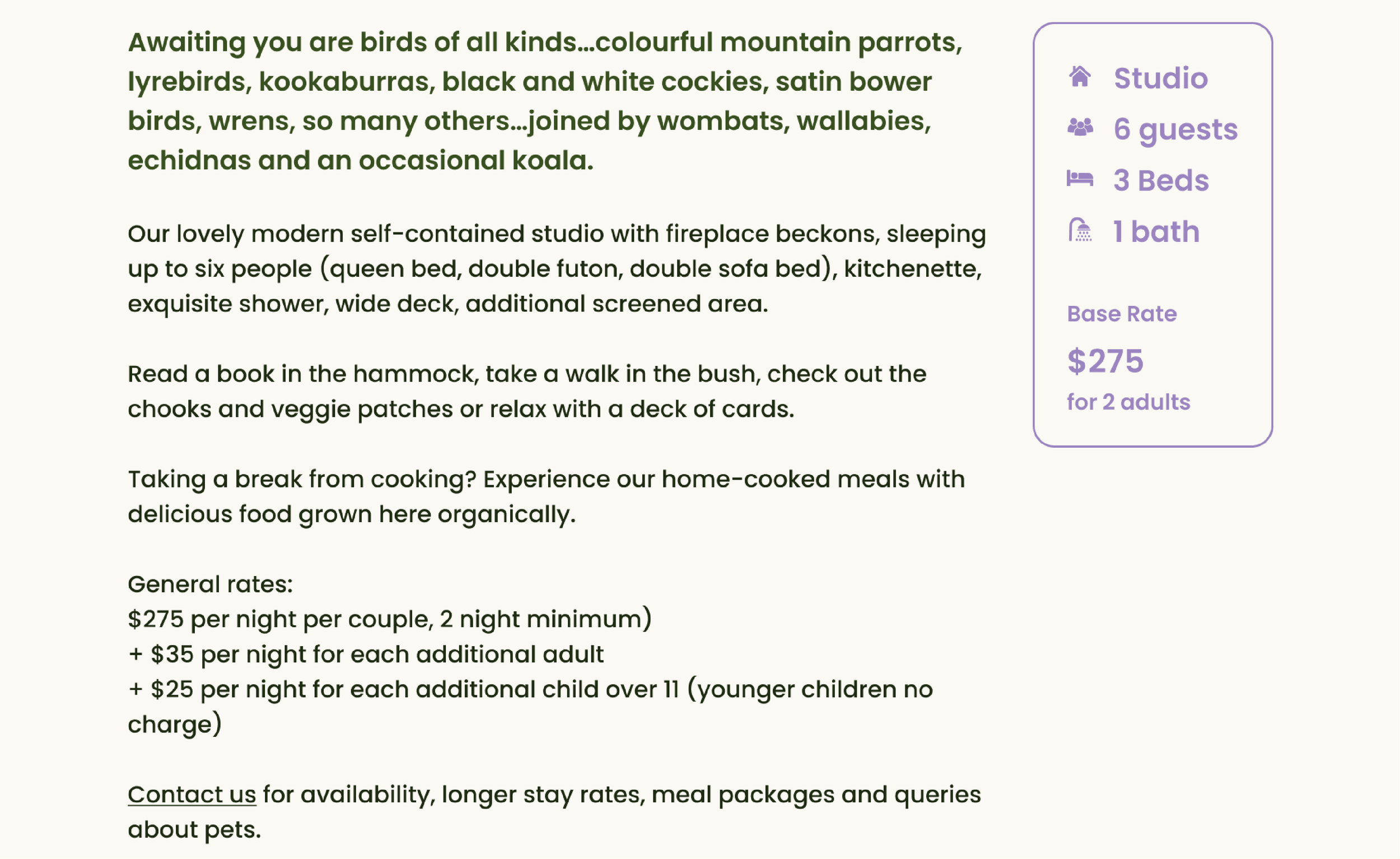
The goal of the accommodation information is to sell the experience of staying there. To do this, I created a visual hierarchy that focuses on the first paragraph due to the larger text size, lighter colour and positioning on the left of the page. The attention is then drawn to the key statistics as they’re in purple, in a container and on the right side. The icons have a solid fill which, along with the purple, feels friendly. Finally, the attention goes to the rest of the body copy which I formatted to ensure there are no orphans.
UI/UX Analysis
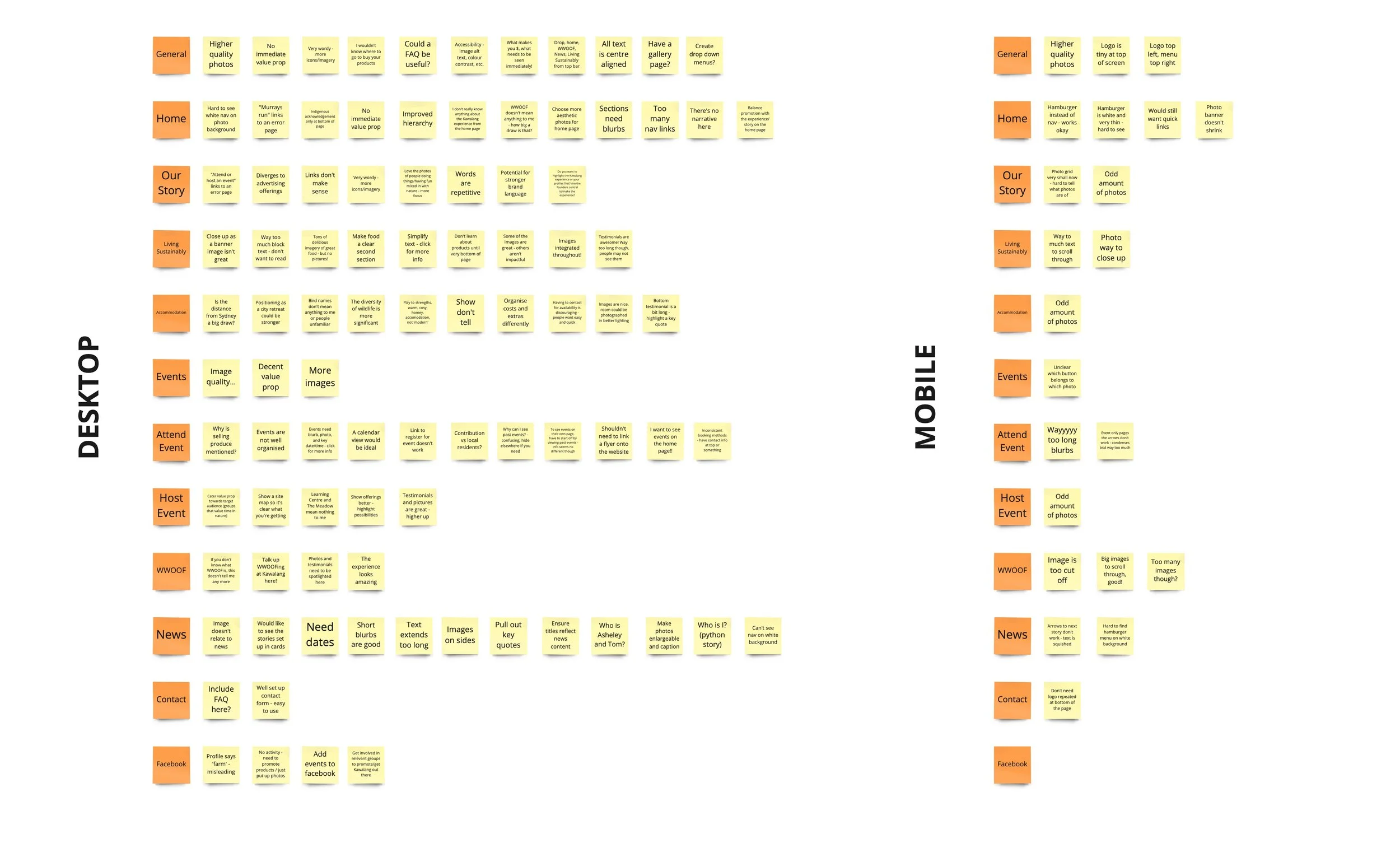
Independent of a meeting with the client to discuss the shortfalls of the Kawalang website, I analysed the existing website. I identified the strengths and weaknesses of the visuals, language, structure, and the possibilities around improving the experience.
Client Workshop
I facilitated a workshop between my team and the client. The goal was to learn more about Kawalang and its values and to get us on the same page with the client regarding the project objectives, methods and collaborative environment.
Information Architecture
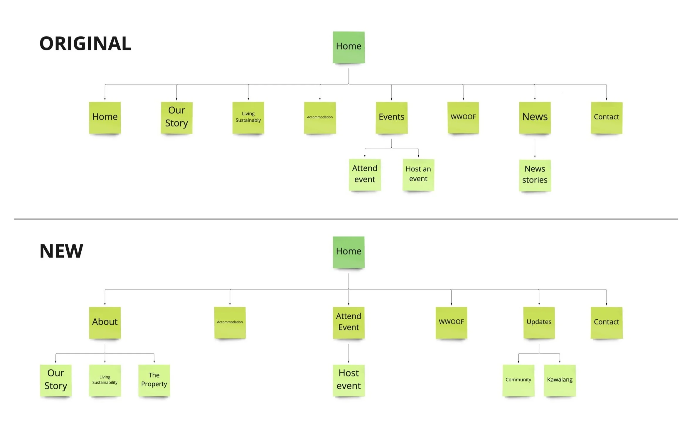
We adjusted the information architecture to suit the shift in Kawalang’s strategy. The goal was also to reduce the pages in the navigation to make it simpler for a first-time visitor to explore or a returning visitor to find what they want.
Low Fidelity Wireframes
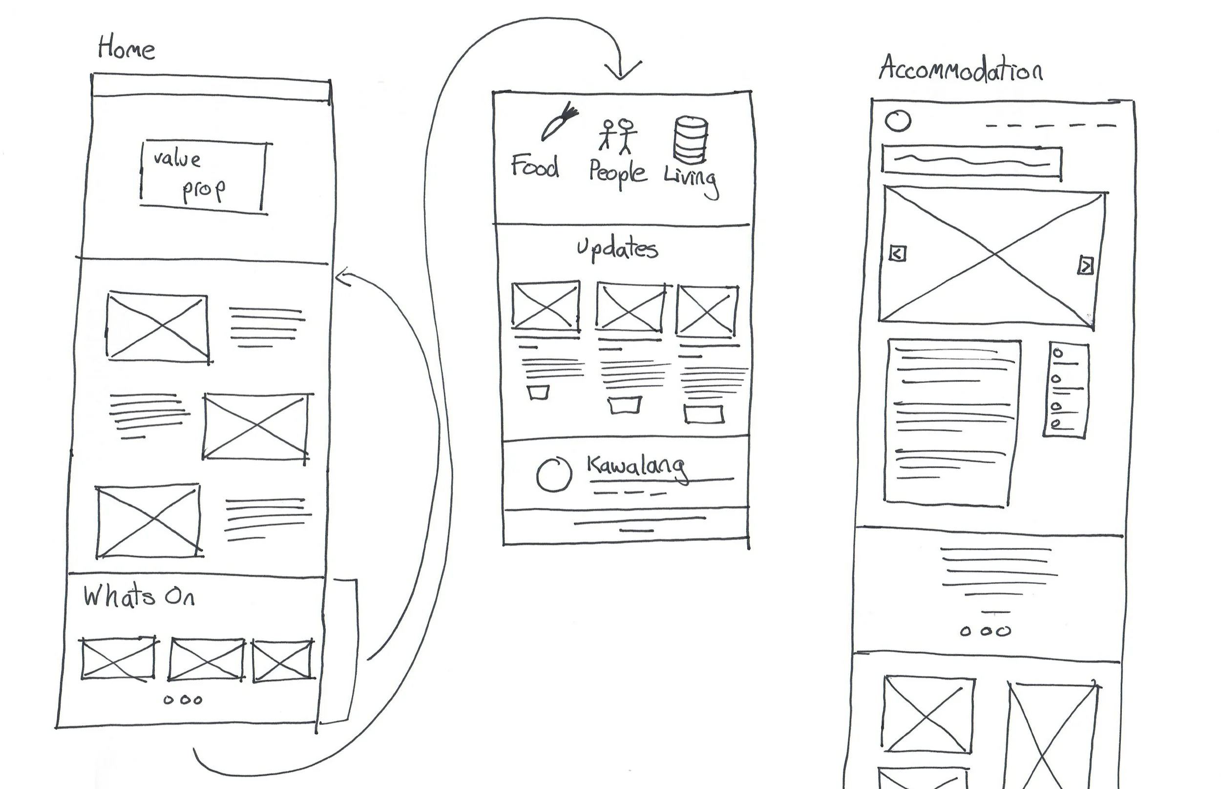
I started the website design process with sketching. This was helpful to start to quickly iterate on what kind of content should go on what pages and in what order.
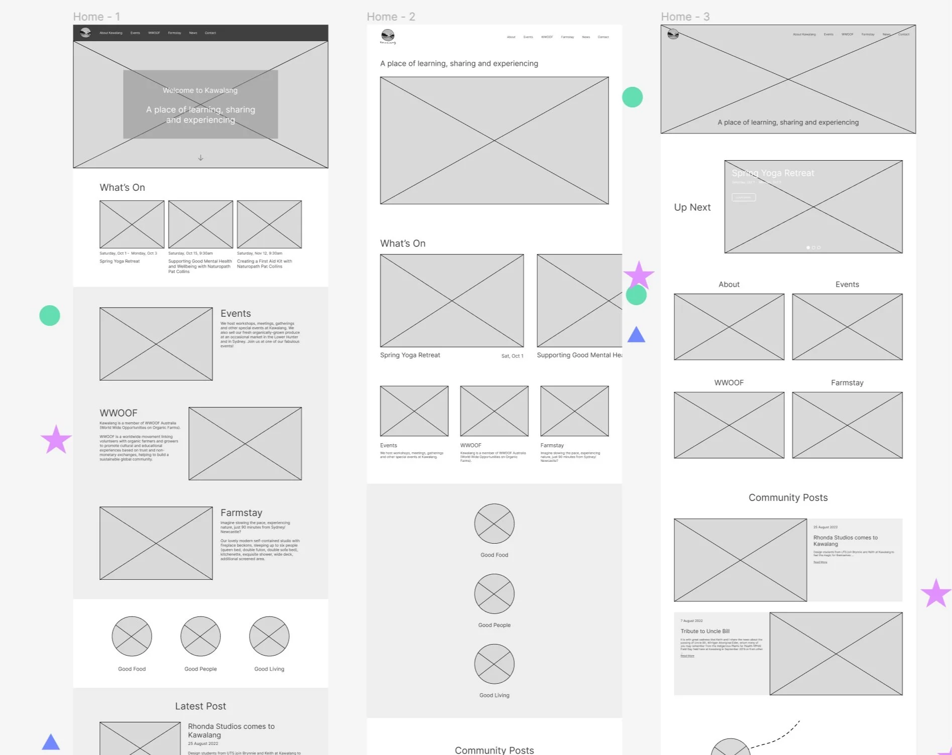
Mid Fidelity Wireframes
The client tended to get caught up on visuals and language, so medium fidelity Figma wireframes helped them focus on the structure. Multiple options to compare helped the client select their favourite elements. My team also voted on each section, and I combined these choices in the next round of iterations.
High Fidelity Wireframes
With the structure down, I introduced visual elements. These designs went through many iterations with the client to ensure they had the right energy and felt authentic for the client. Also, with an older target audience, accessibility was crucial, so we were mindful of the colour contrast and increased the font size.
